Enhancing digital accessibility: overlooked standards
The importance of accessibility guidelines for websites
From my work as a product designer who cares deeply about accessibility, I’ve noticed that it often ends up on the back burner. Teams will tick the basic WCAG (Web Content Accessibility Guidelines) boxes, but miss crucial details that affect not only users with permanent disabilities, but also anyone dealing with temporary or situational impairments. Addressing these common but overlooked accessibility standards early in the design and development process saves you the hassle and cost of retroactive fixes.
Commonly overlooked accessibility standards
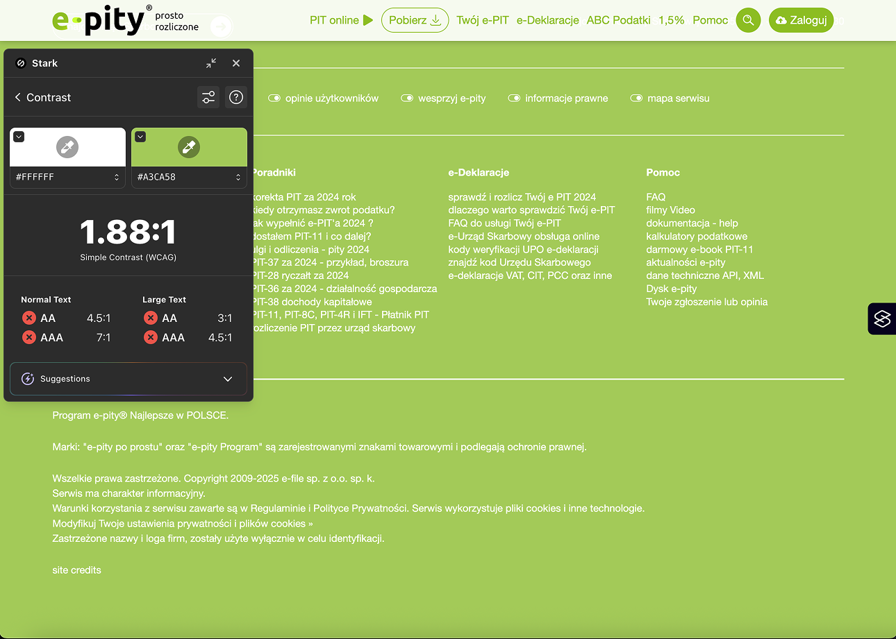
Insufficient color contrast
Color contrast is one of the most basic yet frequently ignored accessibility issues. Many brands stick to their brand colors, following strict guidelines that often weren’t created with accessibility in mind, leading to color combinations that don’t pass contrast checks. Clients frequently insist on sticking to these palettes, unaware of their impact on readability for users with low vision or color blindness.
WCAG requires a minimum contrast ratio of 4.5:1 for normal text and 3:1 for large text. But you’d be surprised how many big-name sites don’t hit that, sacrificing accessibility for aesthetics. And it’s not just about text – buttons, icons, links, all of it needs to stand out. A contrast checker tool takes five seconds. Your users shouldn’t have to squint.
Missing or poorly written accessible names (Alt text for images & icons)
Alternative text (alt text) is essential for screen reader users, yet it’s often missing, redundant, or unhelpful. Non-decorative images, icons, and even functional graphics need meaningful descriptions.
I’ve seen cases where a button with an icon (like a magnifying glass for search) lacks an accessible label, making the search functionality inaccessible to screen reader users. Done right, alt text improves usability and boosts SEO. Two birds, one well-written sentence.
Lack of descriptive links & buttons
Generic link text like “Learn more” or “Click here” doesn’t work well for screen reader users. It strips the link of context, especially when read out of order. Instead, write link text that tells people exactly what they’ll get – “Download the accessibility guide” is far more helpful. Similarly, icon buttons should have accessible names, even if not visible on the screen, to convey their function for screen reader users.
Insufficient font sizes
Small font sizes are a widespread issue, especially in minimalist and mobile-first designs. While WCAG does not specify a minimum font size, best practices suggest a minimum of 16px for body text. Users should be able to scale text up to 200% without breaking the layout, ensuring readability for users with low vision or older individuals.
Insufficient clickable/tappable areas (buttons, links)
If you’ve ever tried tapping a button with your thumb and missed twice, you’ve already experienced the issue. Small touch targets frustrate users with motor impairments or those on mobile devices. WCAG AA recommends a 24x24 px minimum. AAA says 44x44.
Even if a clickable element, such as an icon button, is small for aesthetic reasons, it should have a larger, invisible clickable area that meets usability guidelines and adequate spacing between interactive elements to prevent accidental clicks or tabs. I always advocate for ample spacing and padding around interactive elements to improve usability.
Focus order & focus visibility
Navigating a webpage using only a keyboard should be seamless, yet many websites fail at providing a logical focus order. Elements should be focused on an intuitive sequence that matches the visual layout. Additionally, some designs remove visible focus indicators, making it impossible for keyboard users to know where they are on the page. A strong focus outline improves accessibility without sacrificing aesthetics.
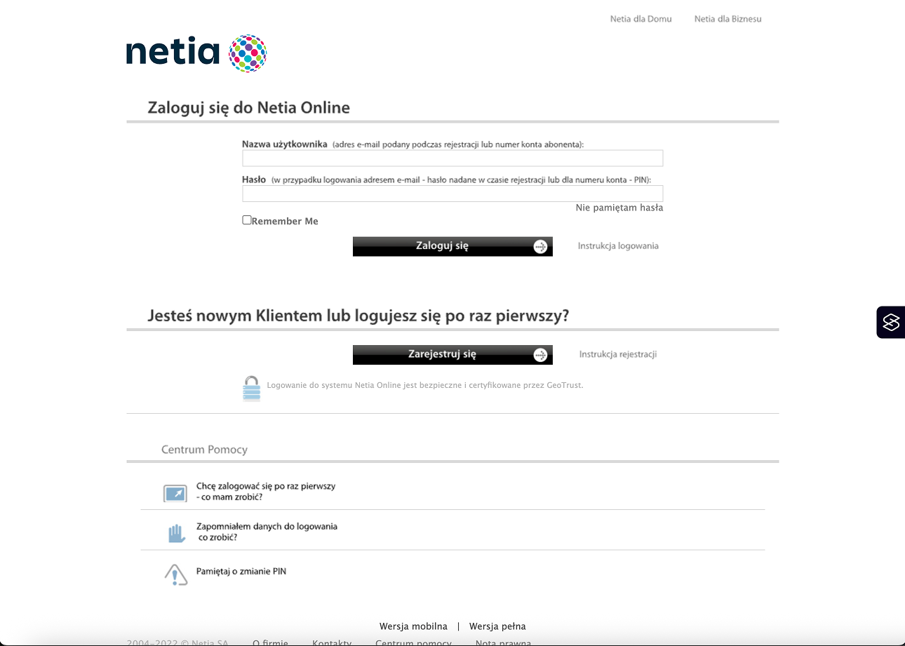
Inaccessible forms and error messages
Missing labels, unhelpful error messages, and placeholder text doing the heavy lifting – it adds up to a frustrating experience, especially for screen reader users. Every input field needs a visible label that’s properly linked in the code, not just some placeholder that disappears the moment you start typing. And when something goes wrong, vague errors like “Invalid input” don’t cut it.
For a solid breakdown of how to get this right, you can refer to WebAIM's guide on creating accessible forms.
Keyboard navigation issues & traps
Many interactive components, such as modals, carousels, and dropdowns, are poorly designed for keyboard navigation. A common issue is “keyboard traps”, where a user becomes stuck in an element without a way to navigate out. Ensuring all components are accessible via the Tab key and that users can escape modals without requiring a mouse is crucial for inclusivity.
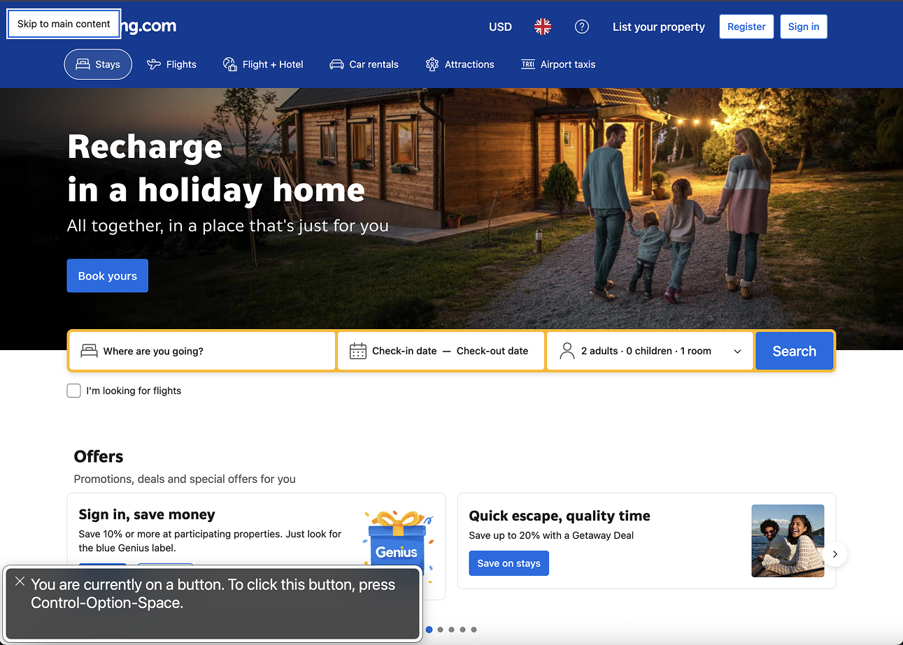
Missing “Skip to content link”
A “Skip to content” link is an essential feature that allows keyboard and screen reader users to bypass repetitive navigation and jump directly to the main content. Without it, they’re stuck tabbing through nav menus every time.
It’s easy to add. It helps more people than you think.
Accessibility and usability go hand in hand. Explore how microinteractions influence inclusive design in Small interactions, big smiles: making users love your interface.
Very dynamic animations without controls
While animations can enhance user experience, they can also be overwhelming for users with motion sensitivities. WCAG requires that users can pause, stop, or hide animations that last longer than five seconds.
Features like auto-scrolling carousels, parallax effects, and flashing elements should be implemented thoughtfully, with options to disable them for users who prefer a more static experience.
Accessibility is a competitive advantage
Accessible sites perform better. Period. They're easier to navigate, index, and share. They reach wider audiences and foster trust. Conducting a website accessibility audit can help identify these issues early on, ensuring your digital products meet the necessary accessibility guidelines for websites.
If you're looking to build accessible and inclusive digital products, our team specializes in designing and developing experiences that meet and exceed accessibility standards. We offer accessible web design services that incorporate inclusive design principles and mobile accessibility standards to ensure your product is usable by all. Let’s make the web a place where everyone can engage, regardless of ability.
FAQ
What are WCAG guidelines?
WCAG (Web Content Accessibility Guidelines) are international standards that help make websites usable for people with disabilities.
Why is accessibility important for business?
Accessible websites reach wider audiences, improve SEO, and reduce legal risks. It’s both good design and good business.
What are the most common accessibility issues?
Poor color contrast, missing alt text, small touch areas, and lack of keyboard navigation are among the biggest issues developers overlook.
How can I make my site more accessible?
Use proper heading hierarchy, add descriptive alt text, ensure sufficient contrast, enable keyboard navigation, and test regularly with accessibility tools.

Valentyna Korniienko
Product Designer
Valentyna is all about crafting digital experiences that are not just awesome, but also super accessible. She loves the challenge of creating products that balance user needs, business goals, and tech capabilities.

Sebastian Spiegel
Backend Development Director
Inspired by our insights? Let's connect!
You've read what we can do. Now let's turn our expertise into your project's success!